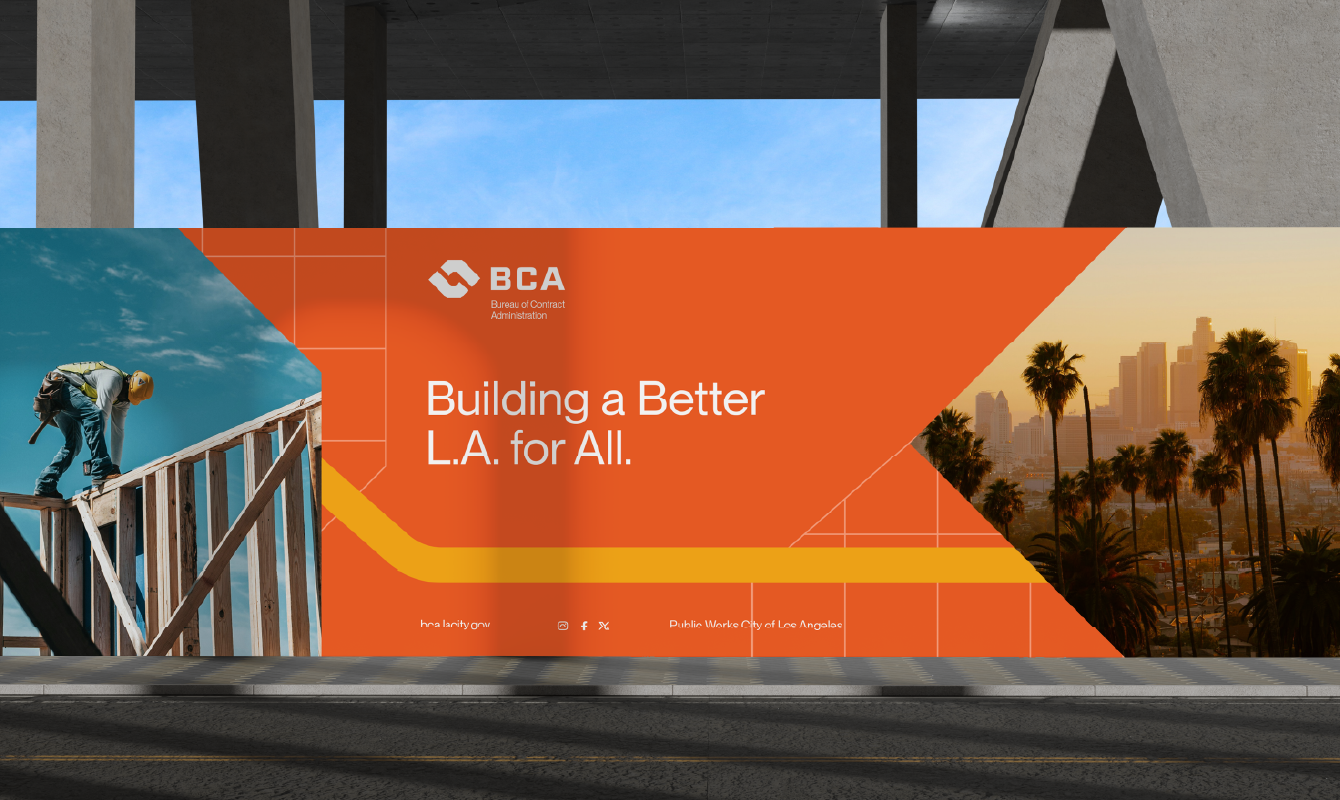
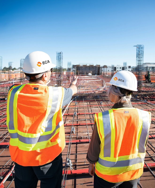
Los Angeles’ BCA operates where civic growth, regulation, and accountability intersect. Our design direction positioned the Bureau as the connective force linking city projects, workers, businesses, and infrastructure, clarifying its vital role while reinforcing the processes that allow progress to move forward safely, equitably, and with confidence.
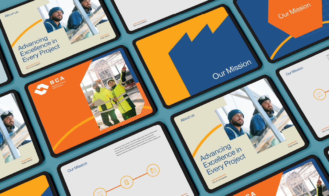
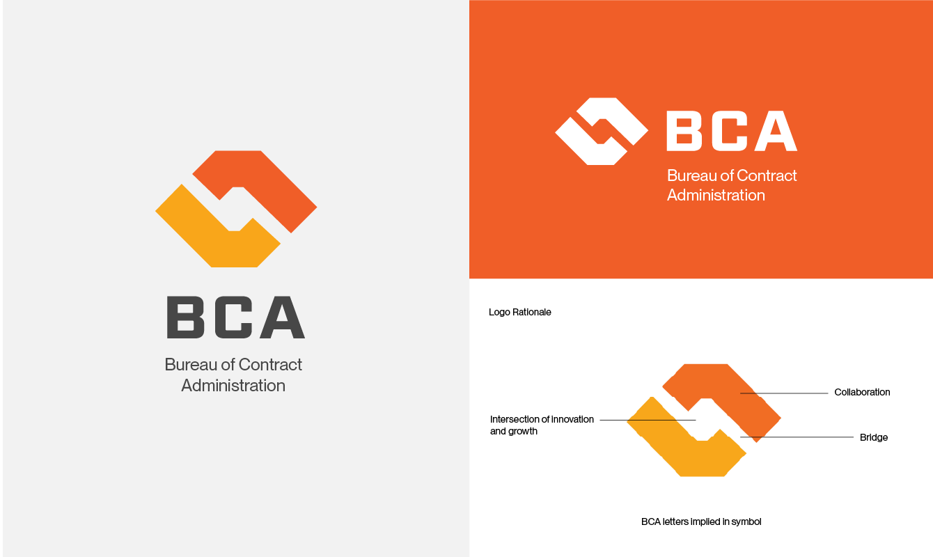
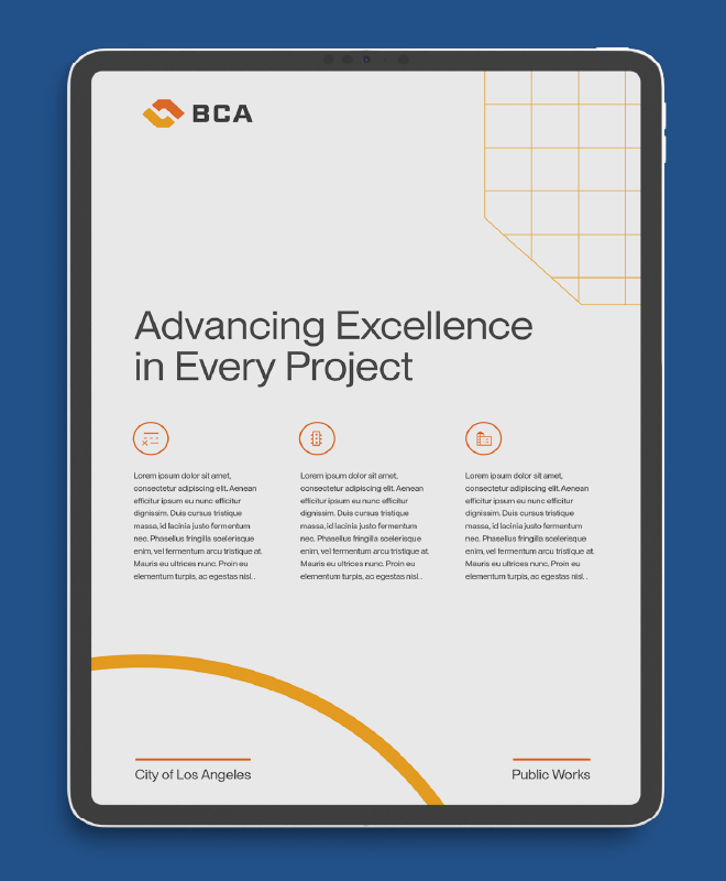
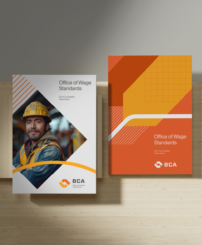
The visual system drew inspiration from industrial and mechanical craftsmanship. Sharp geometry, precise linework, and modular forms reflected the real-world environments BCA operates in, demonstrating the durability, authority, and rigor required to steward and safeguard public projects across an evolving city.
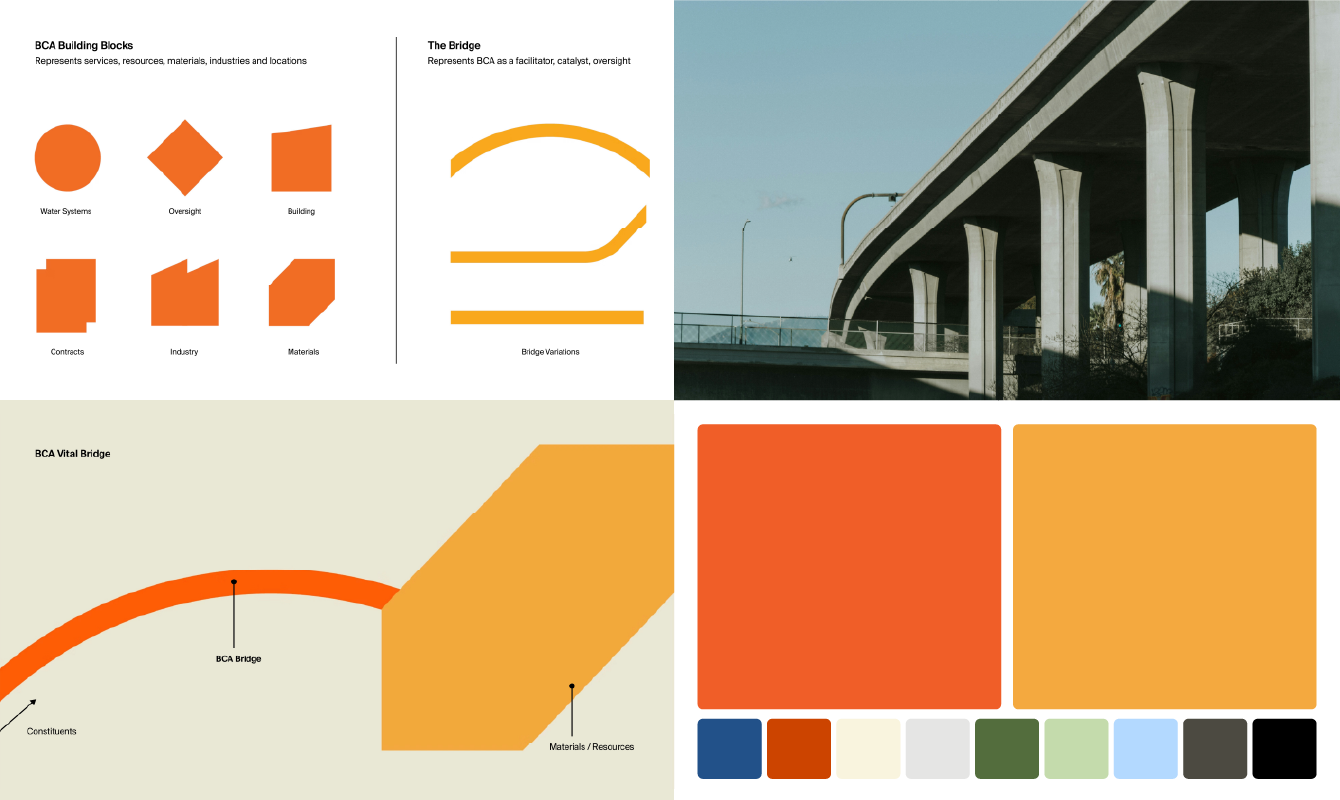
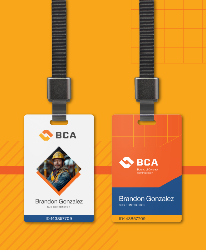
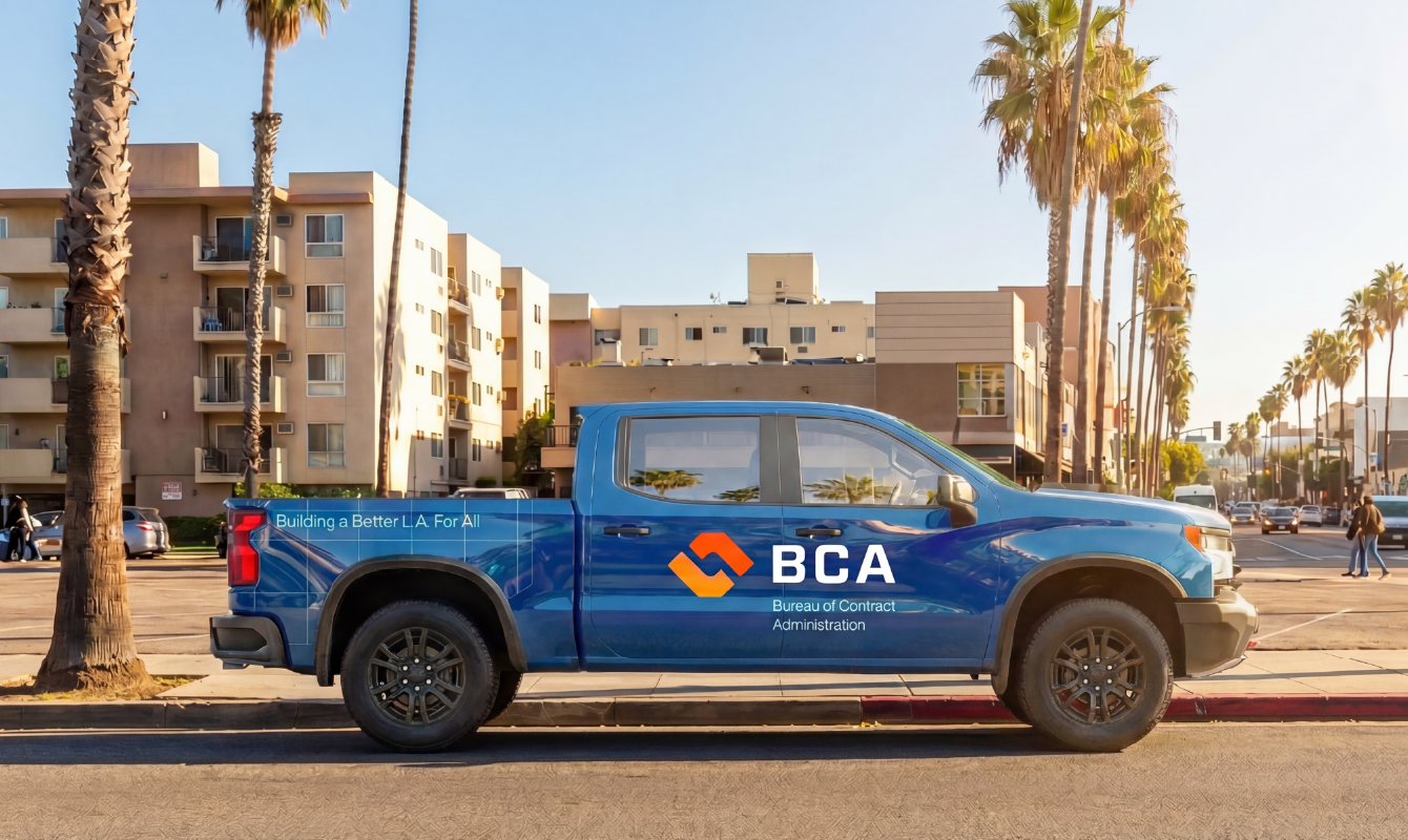
A bold orange-and-yellow palette rooted the identity in construction and public safety, while flexible logo configurations allowed the system to scale across departments and applications. The result was a modular system designed to reduce fragmentation, improve brand recognition, and remain adaptable as the Bureau’s responsibilities continue to grow. In the end, our work reflected the heart of BCA: an adaptive brand that communicates complexity with integrity, simplicity, and now, design-forward clarity.
In civic work, progress rarely follows a straight line. While implementation paused, this identity system created internal alignment around a clearer, more unified positioning for BCA, establishing a foundation the Bureau can return to when timing and priorities allow. The work reflects our belief that thoughtful design can strengthen public trust long before launch.