+ Downtown Corona
Downtown Corona:The Circle Identity
Our roles
Overview
Following the successful rebrand of the City of Corona, Pastilla was tasked with creating a distinct identity for its downtown district, The Circle, as it undergoes revitalization. The goal: honor the city’s storied past while establishing a bold, welcoming brand for the future. Through thoughtful design, Pastilla helped shape a visual narrative that connects history, community, and a vision for what’s to come.


CHALLENGE & OBJECTIVE
The city needed a brand that could live within the larger Corona identity yet stand on its own. The challenge was twofold: celebrate the district’s deep-rooted history and energize its future. The brand needed to attract visitors, engage residents, and lay the foundation for a thriving cultural and commercial hub.

VISUAL IDENTITY EVOLUTION
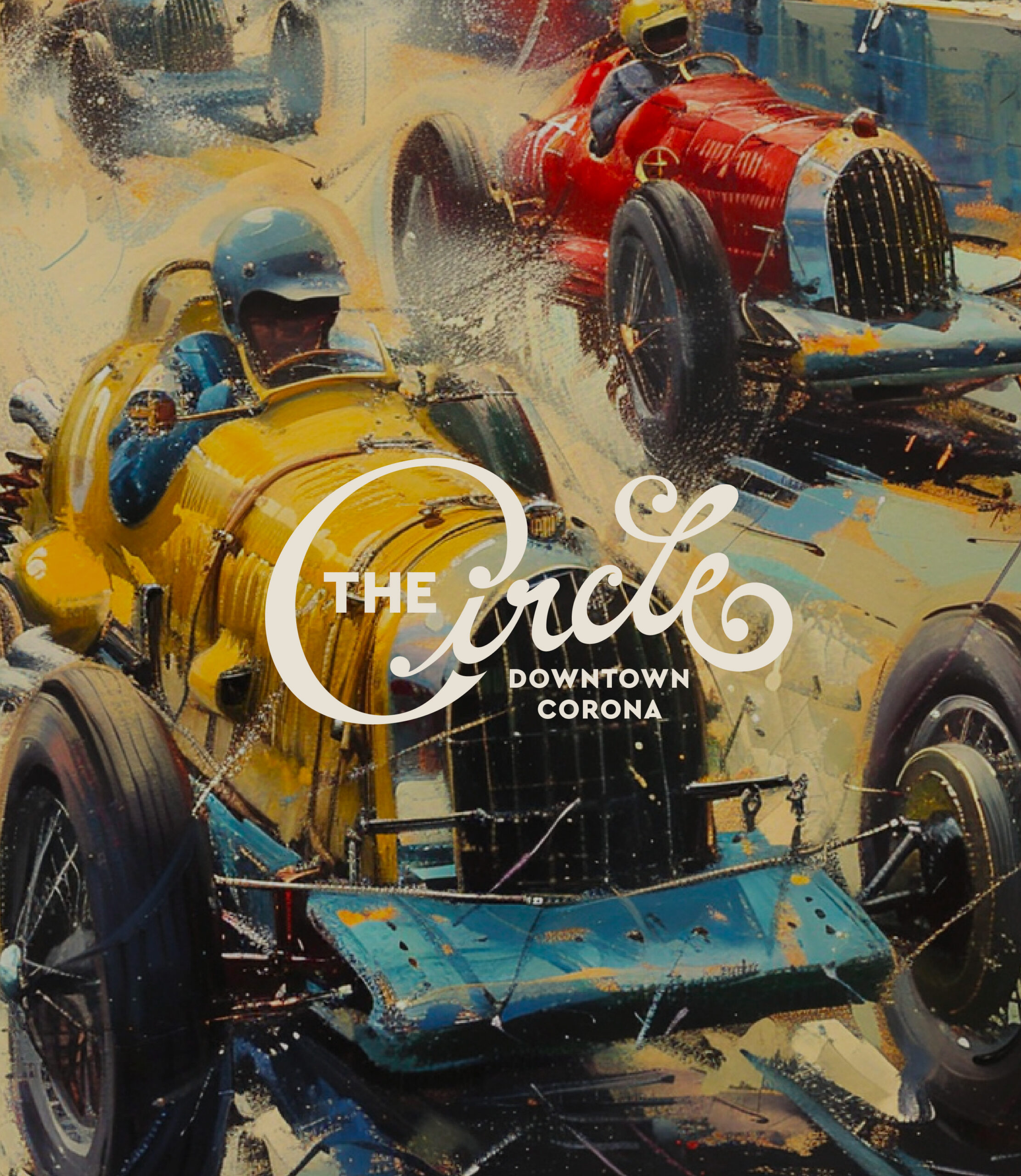
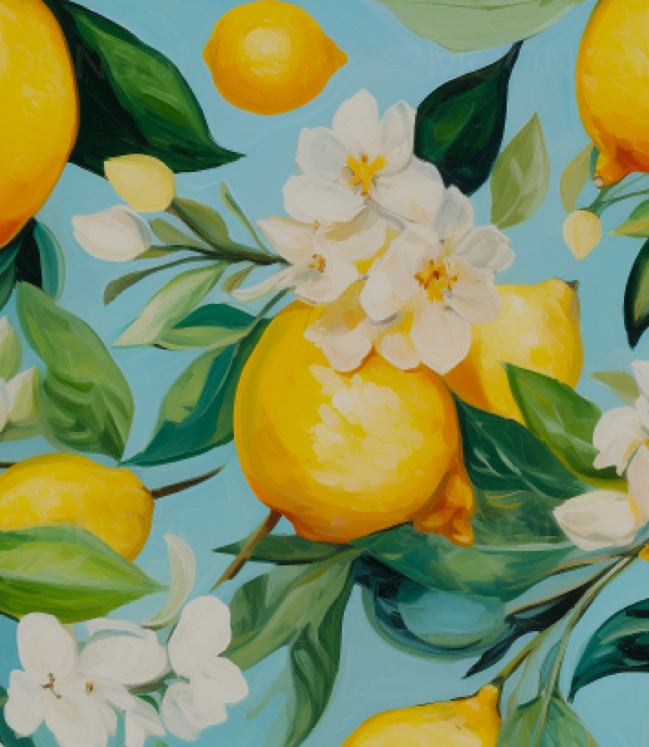
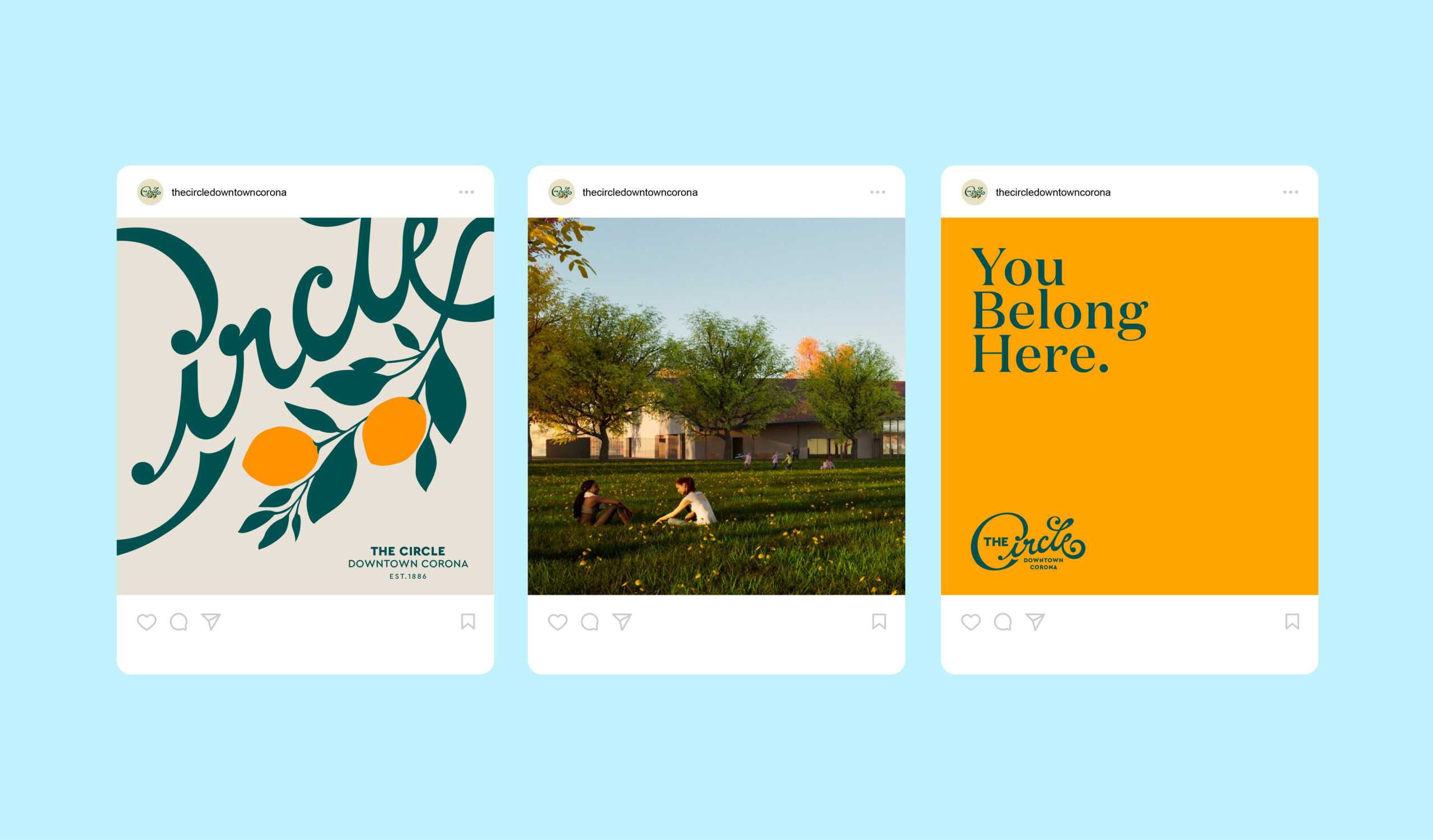
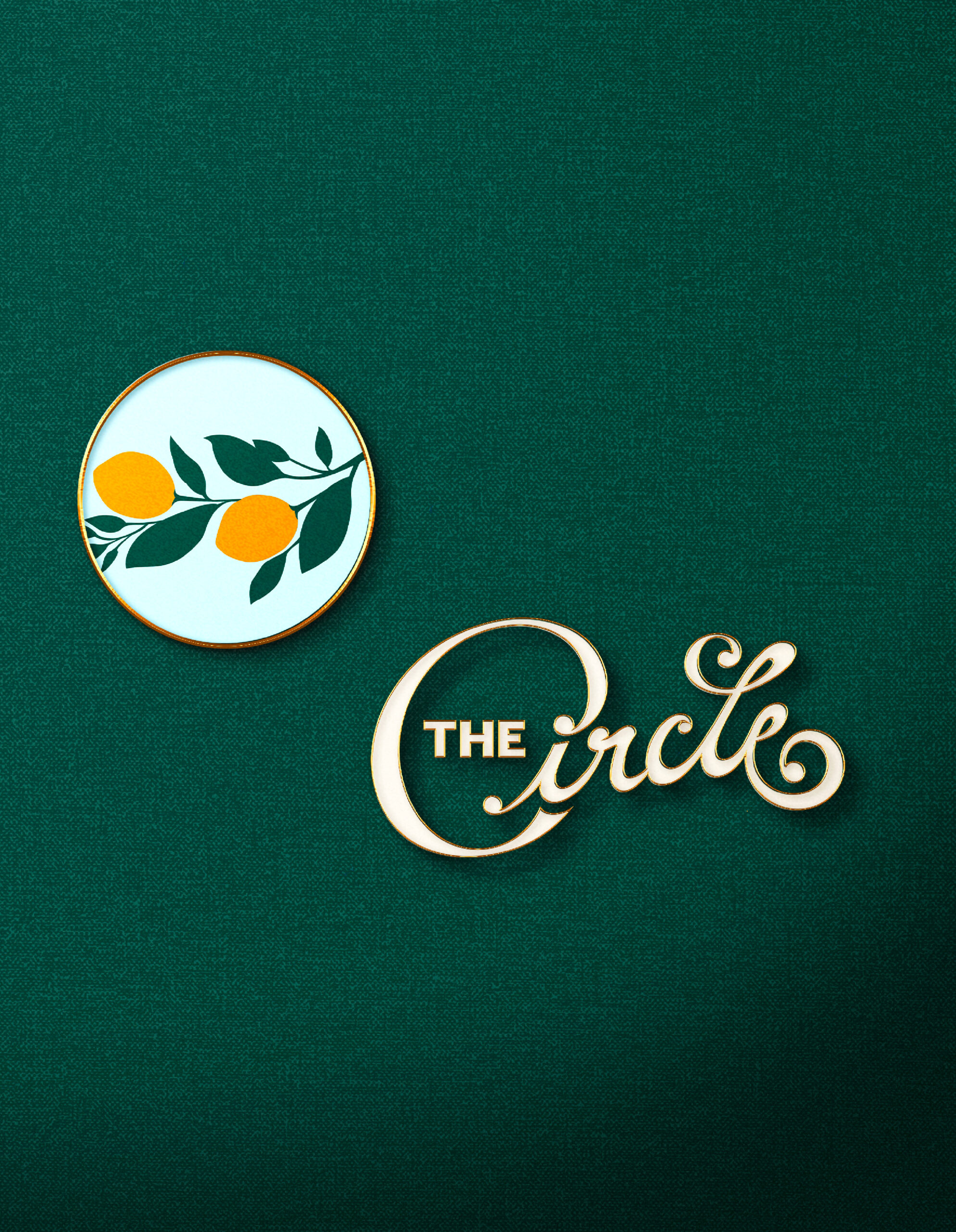
We pulled inspiration from Corona’s iconic past: its title as the former lemon capital of the world and home to a historic circular race track. A custom, swooping “C” logo references the original raceway, while lemon-yellow tones and citrus green hues nod to the region’s agricultural heritage.


TYPOGRAPHY & BRAND STORYTELLING
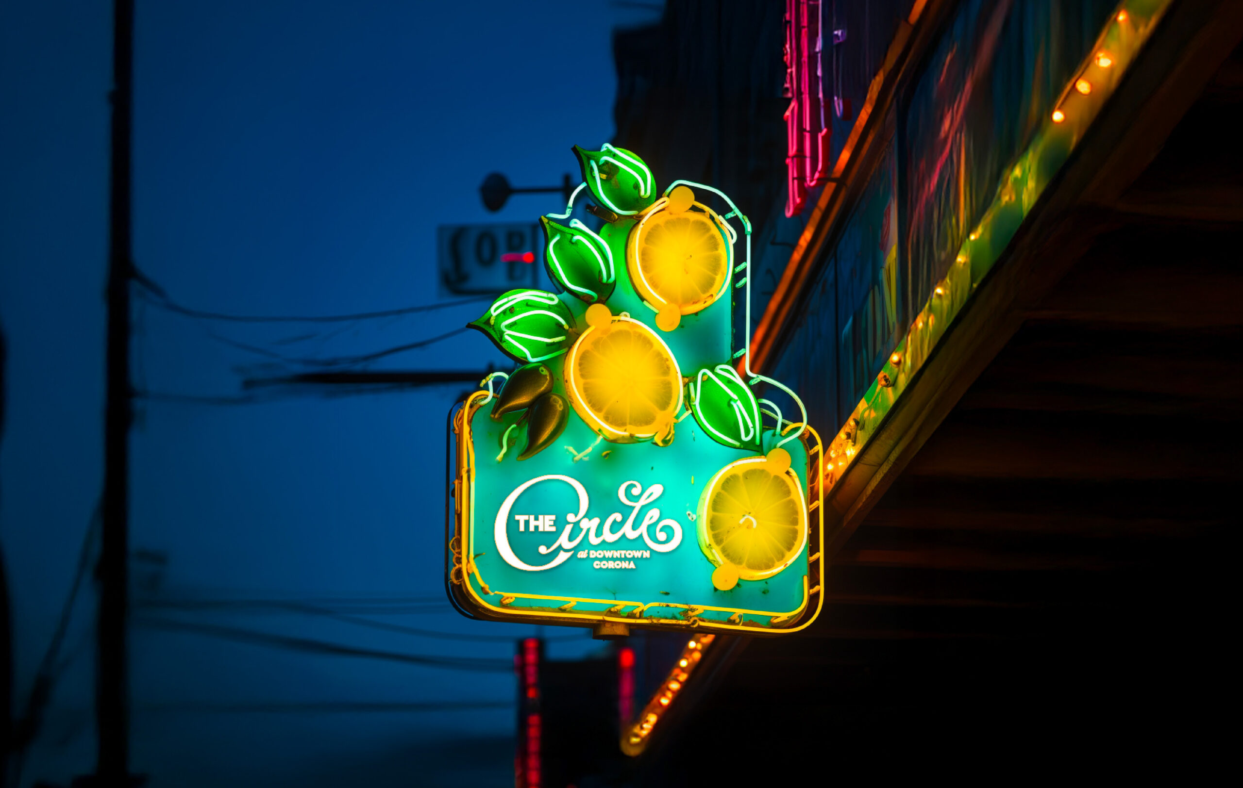
Typography played a key role in storytelling. The vintage, hand-lettered style mimics the look of early 20th-century race and produce advertisements. The letterform curls into a lemon branch, weaving symbolism directly into the brand. Additional lockups introduce “Downtown Corona” for flexible use in broader marketing contexts.

We built a brand rooted in history, designed to welcome the future of downtown Corona.
COLOR & PHOTOGRAPHY DIRECTION
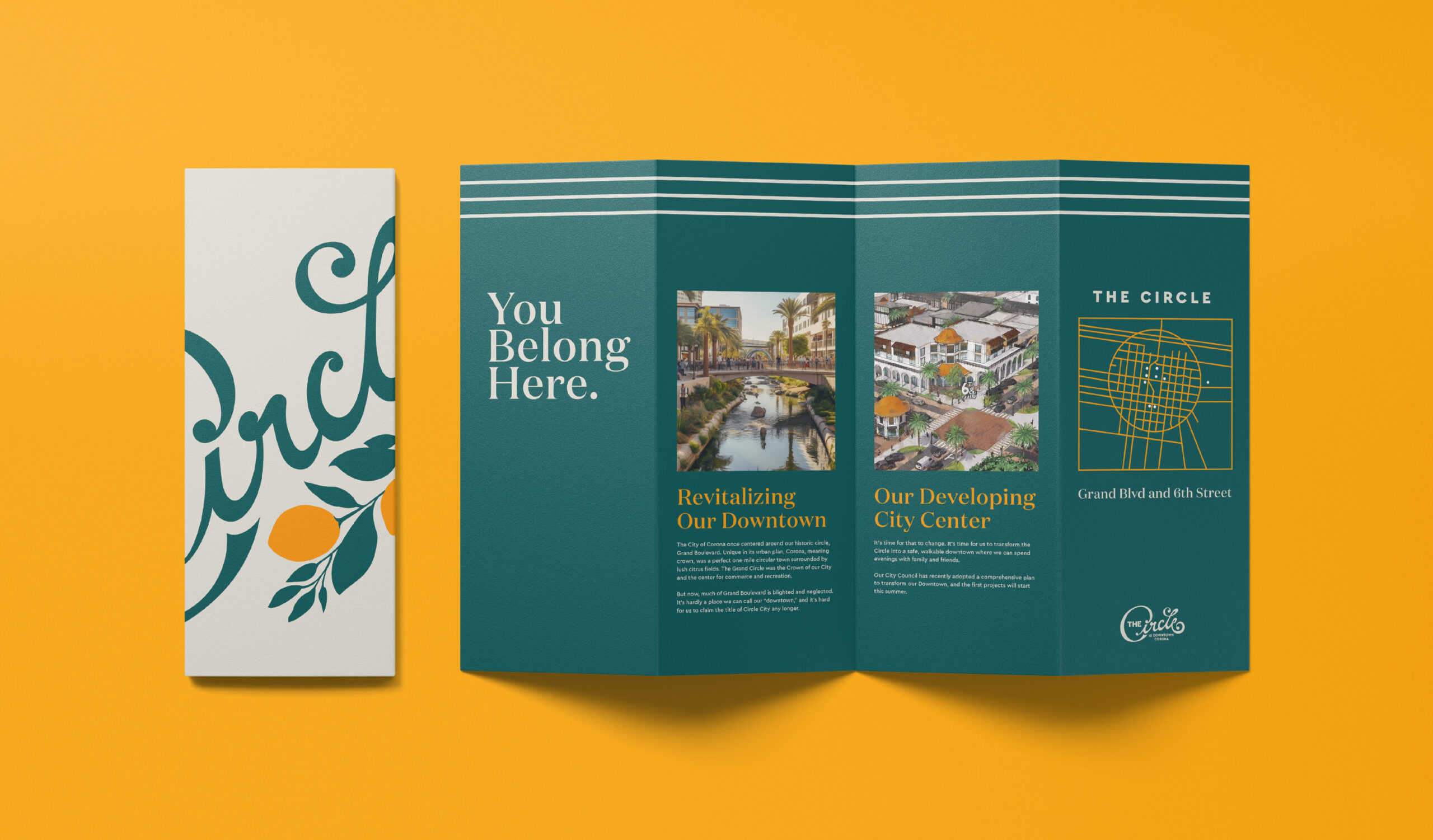
The brand’s palette is vibrant and optimistic—anchored in yellows and greens, with pops of blue to evoke freshness and energy. Photography brings the vision to life, with visuals focused on families, community interaction, and the lively spirit Corona hopes to cultivate downtown.
BRAND IMPLEMENTATION
Though The Circle’s physical revitalization is still in progress, the brand has already taken root. It’s been rolled out across the district’s website and marketing materials—building excitement and offering a preview of what’s to come.


Designed to evolve with the district, the brand speaks to both heritage and new beginnings.


By honoring the past and designing for the future, we helped The Circle become a brand that invites connection, pride, and possibility.

+ Success Metrics
Brand live on Downtown Corona’s official website and digital channels
Visual identity actively used in promotional materials and community outreach
Positive feedback from city stakeholders and local residents
Foundational system ready to scale with district development