
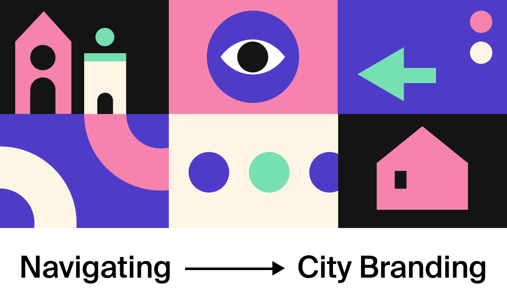
+ The Art and Science of City Branding
Standing out allows a city to attract tourists, businesses, and residents, fostering economic growth, cultural development, and community prosperity. A distinctive city brand can also enhance civic pride.
City branding is the pinnacle of marketing prowess. It’s more than just a promotional tool; it’s a strategic endeavor that blends practicality with creativity. In our experience, we’ve identified two critical aspects of city branding: the logistical challenges of updating the logistics and the creative pursuit of crafting a unique and resonant identity.
Throughout this article, we’ll delve into the art and science of city branding, exploring the strategies that empower cities to thrive and grow.
Consistency is the cornerstone of effective city branding. By presenting a unified message and visual identity, cities can foster a sense of belonging among residents and visitors alike. Repetition plays a crucial role in this process, akin to learning the lyrics of a favorite song. As a city’s brand is encountered repeatedly, it becomes ingrained in the community’s consciousness, evoking familiarity and connection.
Consider the iconic “I Love New York” campaign. Launched in the 1970s to promote tourism in New York City and the state, this branding initiative exemplifies the power of consistency and repetition in branding.
The simple yet memorable “I Love New York” logo, featuring a heart symbol instead of the word “love,” became ubiquitous across various media platforms, from billboards to merchandise.
As people encountered the “I Love New York” logo repeatedly, whether on TV, in magazines, or on street signs, it became synonymous with New York City’s vibrant energy and cultural richness. Over time, this fostered connection, making the brand an integral part of everyday life for New Yorkers and millions of people worldwide.
Pastilla’s branding work for the City of Corona followed a similar trajectory. After ten months of audience research, interviews, and engaging with over 2,200 citizens, a new identity emerged, anchored by the universal message “You Belong Here,” reflecting the city’s core values of familial warmth and inclusivity.
After uncovering the message, the focus shifted to addressing the second aspect of city branding: dealing with the logistics.
The visual symbols a city chooses carry significant weight, acting as its identity’s ambassador to the world. However, cities often grapple with outdated seals and logos that fail to effectively communicate their essence, leading to confusion among residents and visitors alike. To address this challenge, it’s crucial to differentiate between official seals, steeped in tradition, and adaptable logos designed for modern communication needs.
The City of Corona faced a similar issue and needed a strategic update of its branding logistics. Corona’s logo at the time, which was essentially a complex seal, proved impractical for modern city communication needs. Pastilla’s task was to design a simplified logo that offered flexibility for print and digital usage while embodying symbolism and contributing to a vibrant identity system.
The redesigned logo, departing from the complexity of the previous seal, incorporates symbolic elements such as the town circle, crown, and mountains, each carefully chosen to reflect the city’s character and heritage and the message of belonging. It also encapsulates Corona’s present and future aspirations within a single, iconic symbol. The crown, typically linked with royalty, assumed a fresh significance as a symbol of unity and advancement for the people of Corona.
Not overlooking the seal, Pastilla revisited it and paired it with the logo, focusing on storytelling and nodding to the pivotal elements that have shaped the city’s journey from its inception to its current status.
While the logomark symbolizes the city’s present and future amalgamated into one symbol, the seal pays homage to its historical narrative. By redesigning them, Corona clarified and distinguished the two elements, reducing confusion and improving brand recognition.
In conclusion, city branding is not merely about logos and visual identities; it’s about crafting a narrative that resonates with residents and visitors alike. By presenting a unified message and visual identity, cities can foster a sense of belonging and attract attention, resources, and investment.
Cities can create a cohesive brand identity that reflects their values and aspirations through a dual approach that addresses both logistical challenges and creative storytelling. Effective city branding is crucial for cities’ future success, shaping how they are perceived and experienced, paving the way for a brighter and more unified future.