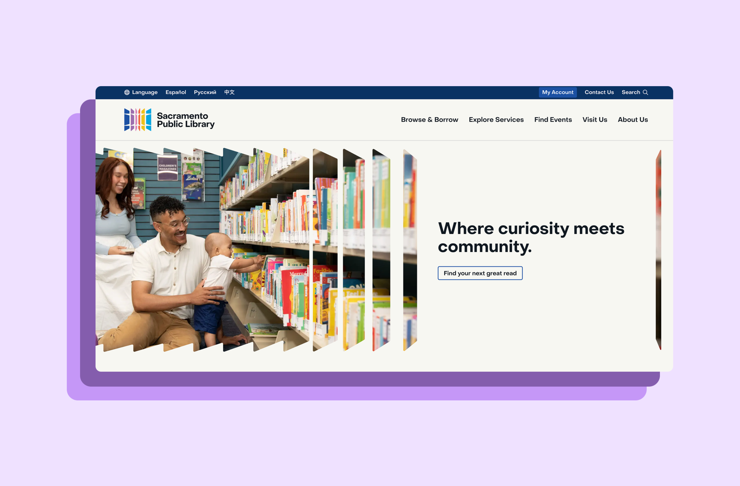
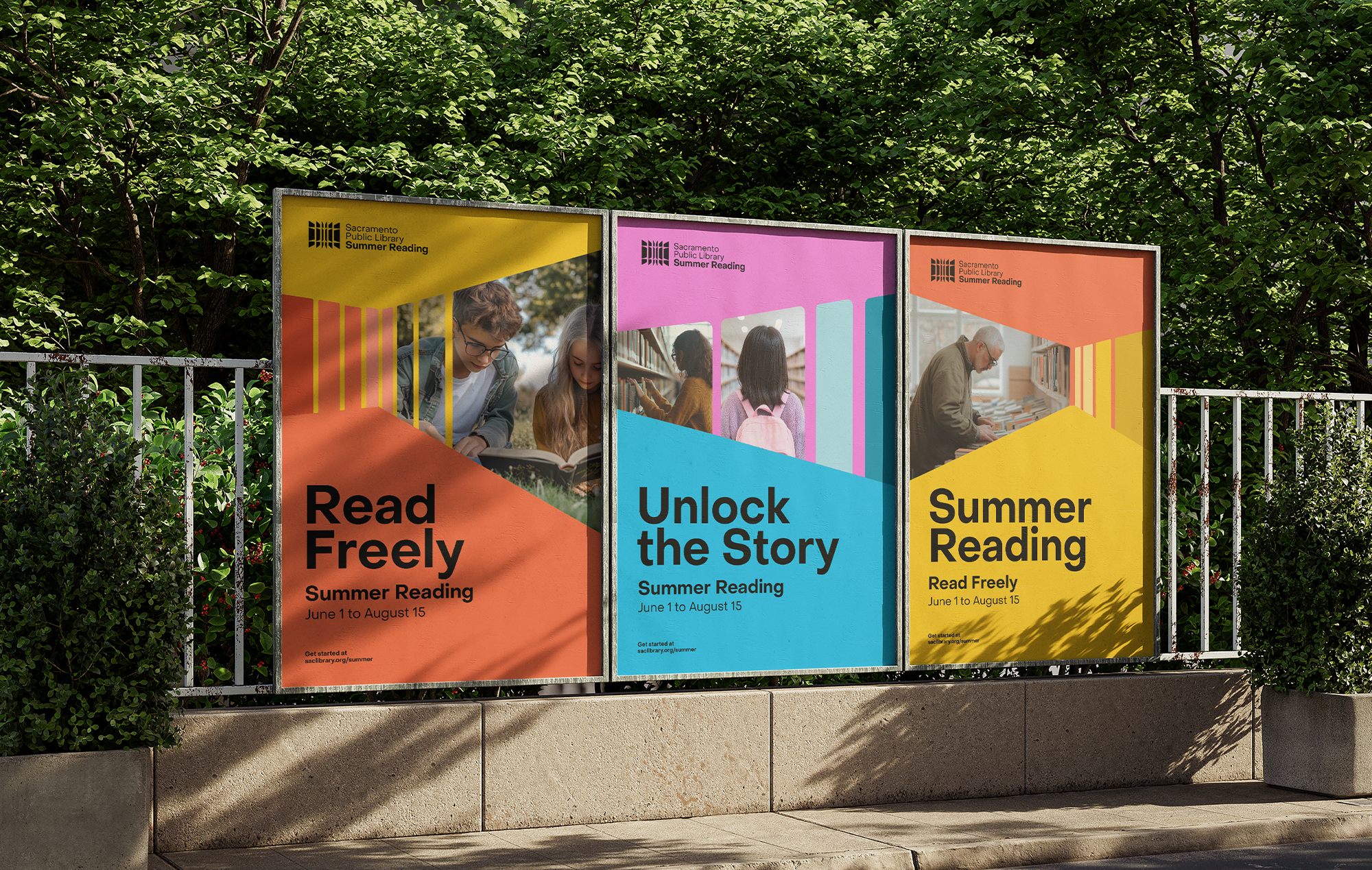
When Sacramento Public Library approached us, they weren’t asking for a logo. They were asking for belonging, a way to visually connect every branch, program, and partnership into something that felt proudly one system, yet flexible enough for every neighborhood’s unique voice.
We began not with design, but with listening. Patrons, staff, parents, veterans, and students shared what the library means to them: safety, wonder, access, possibility. Those conversations became our compass, shaping a design that would feel less like a system and more like a shared story.
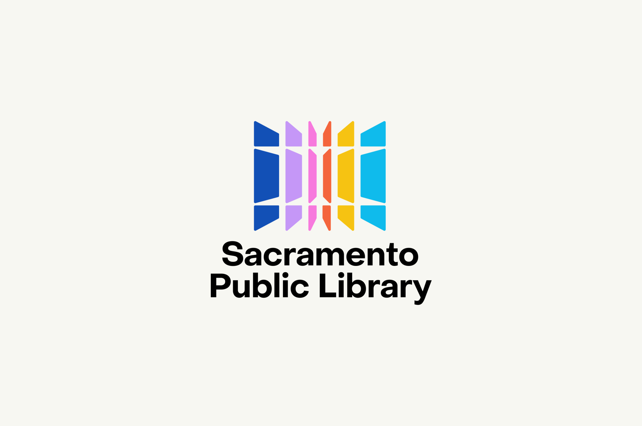
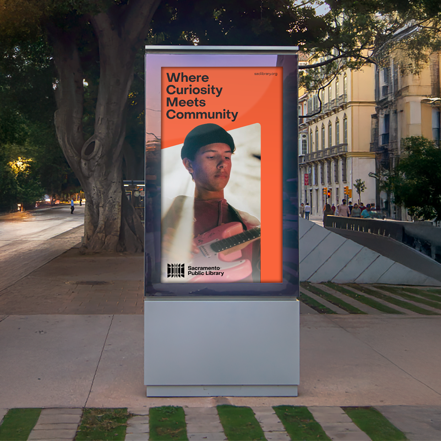
The identity began with a shift in perspective: the library isn’t just a place that stores knowledge; it’s a place that sparks it. Sacramento Public Library empowers people to expand their understanding of the world, to dive deep into discovery, and to grow intellectually and creatively. Books are part of that story, but they are not the whole story. The library is a dynamic resource hub, responding to community needs, reaching new audiences, and continually innovating to support lifelong learning.


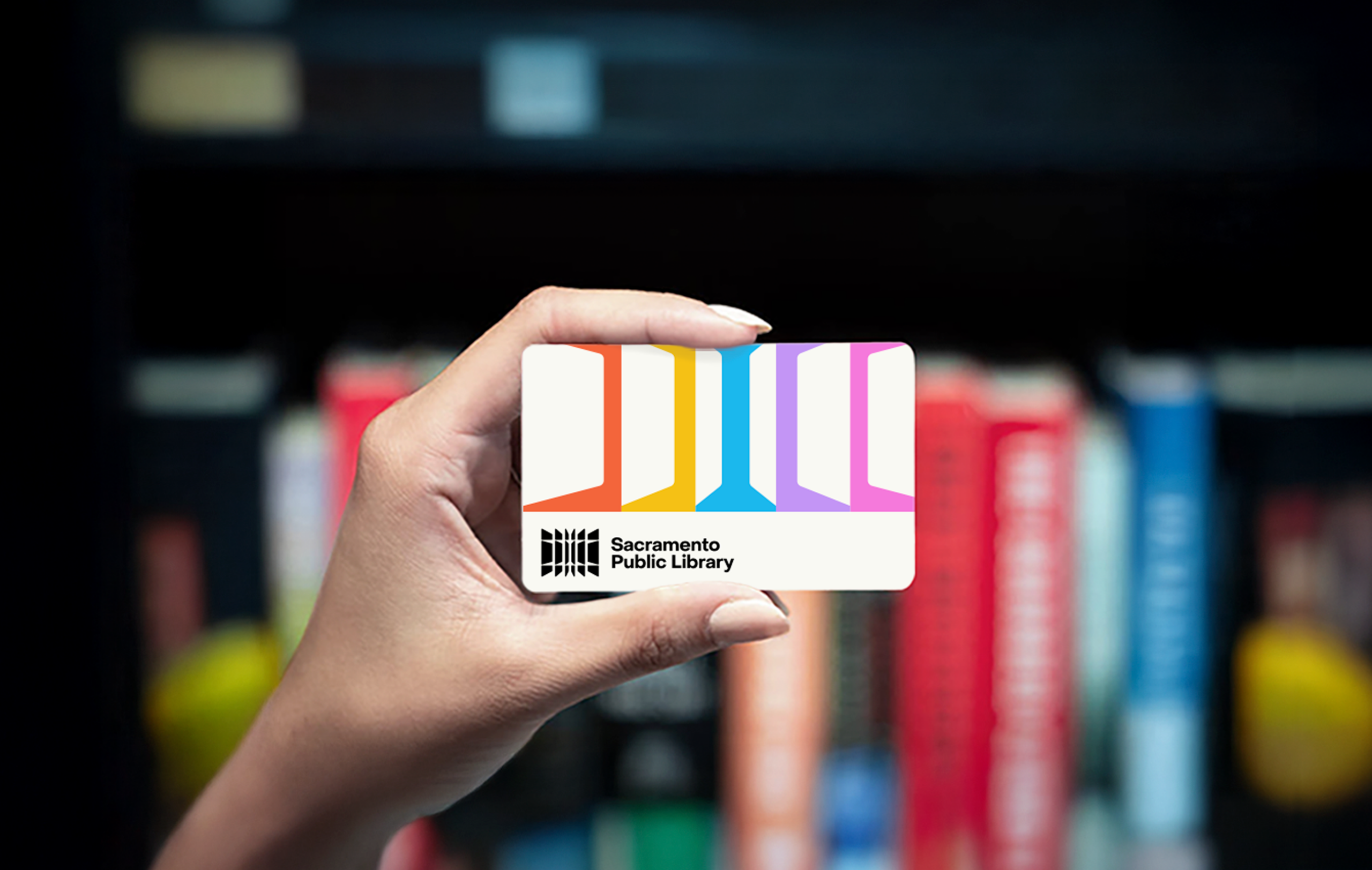
The new logomark reflects this expanded role. It symbolizes connection, exploration, and growth, capturing the vibrant interactions and shared experiences that unfold both inside and beyond library walls. Using negative space, the mark visually maps the many pathways that ideas and individuals take as they intersect: learning, creating, searching, and questioning. It highlights the library as a portal to infinite resources, not a static archive. The geometry suggests movement and momentum: knowledge opening, curiosity unfolding, community building.
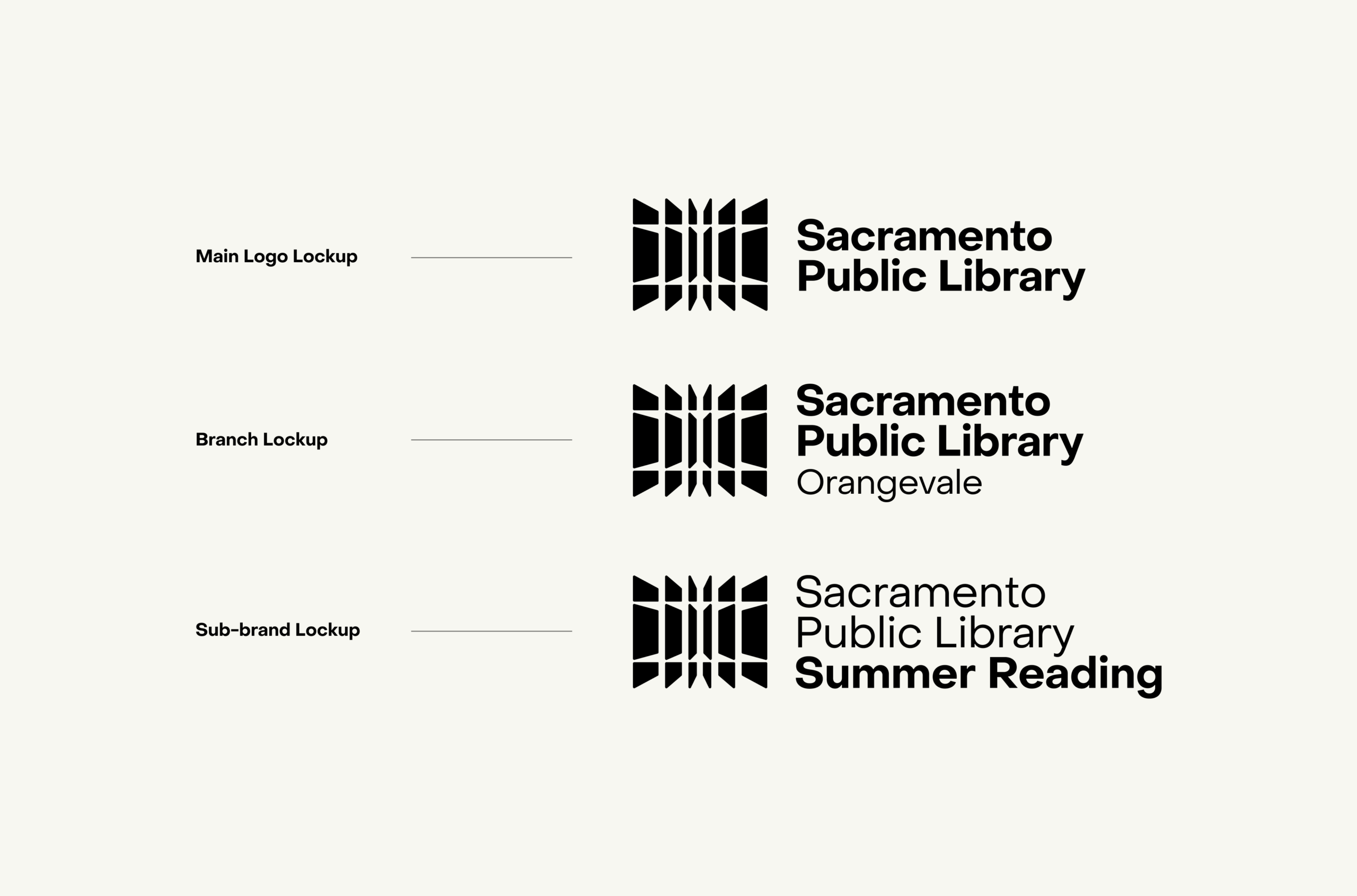
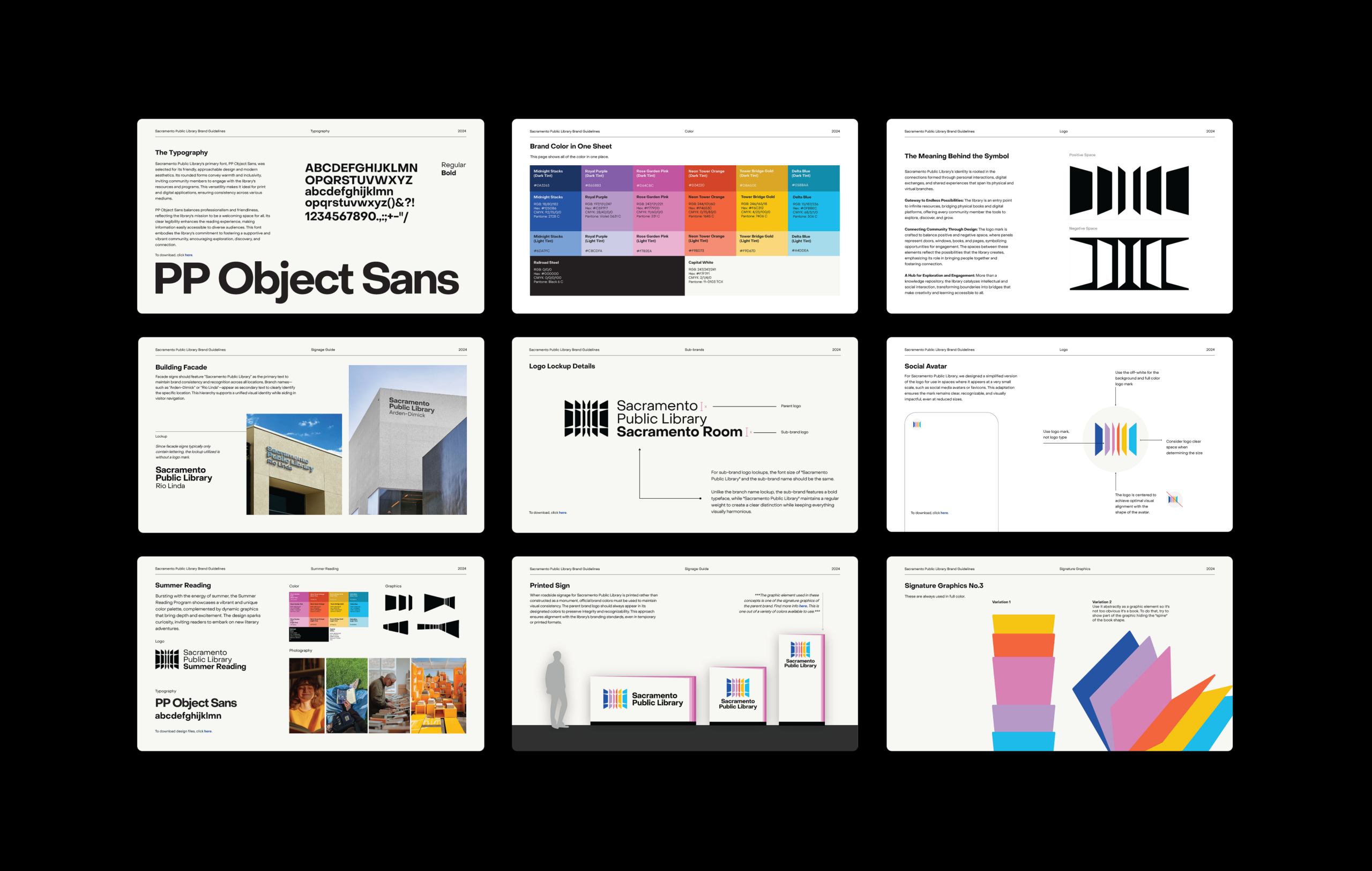
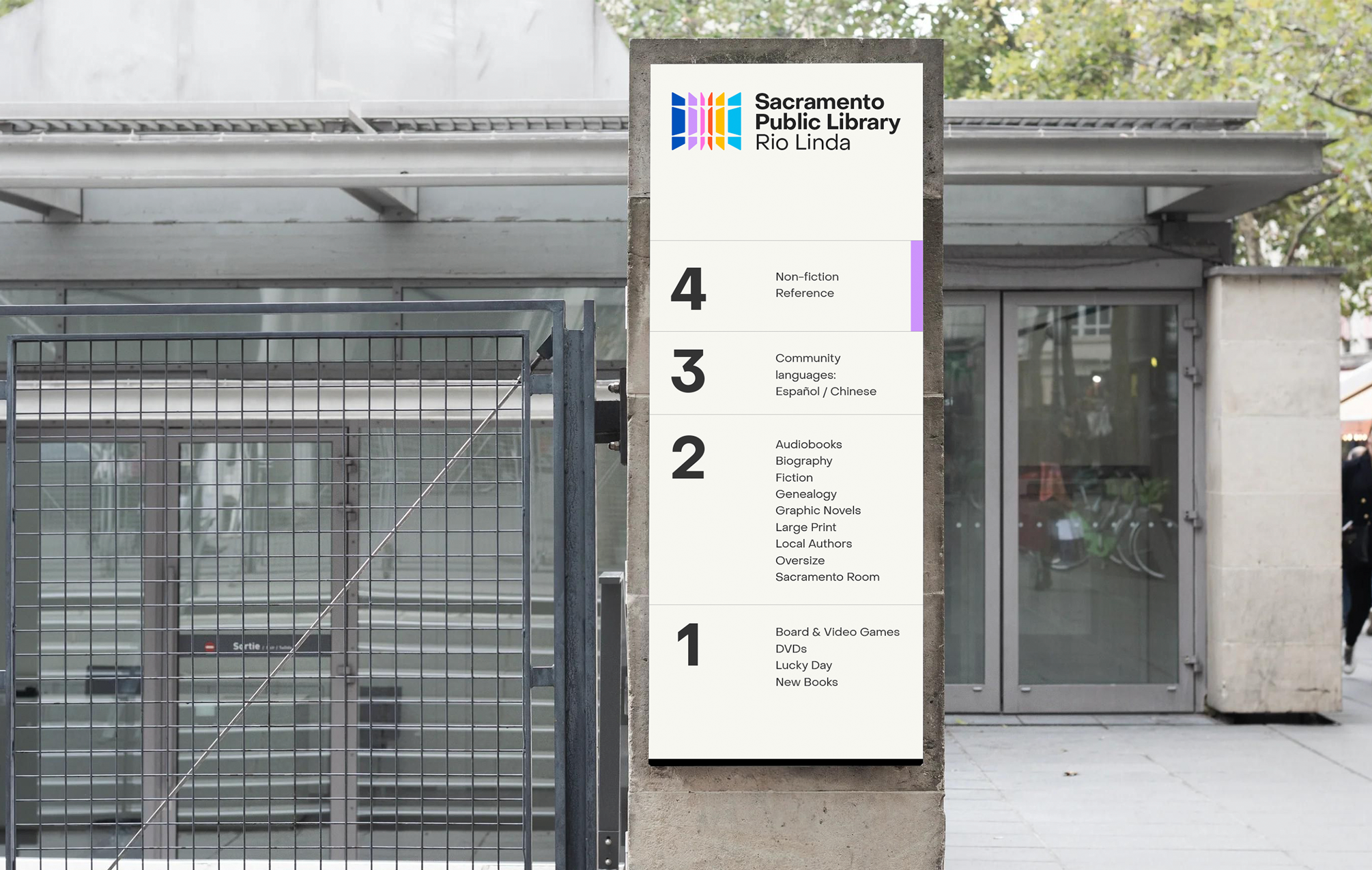
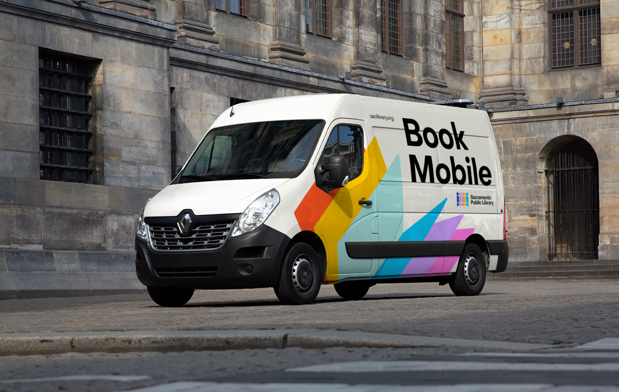
templates, signage standards, and accessibility checklists that give every branch the confidence to implement the brand in their own context. The result is an identity that is coherent but not rigid, one that empowers staff, welcomes patrons, and reflects the library’s role as a catalyst for growth and connection across Sacramento’s diverse communities.